
5 Dining Room Paint Colors For An Entertaining-Worthy Space

We’ll always love these timeless hues.

Amy Neunsinger
Mama always told us not to judge a book by its cover, but what about a dinner party by its dining room? While pimento cheese, gumbo, and Grandma’s buttermilk biscuits will always be delicious and devoured down to the very last crumb no matter where they’re served, good food is certainly more fun to eat in a beautiful space. Keep your dining room from feeling outdated or boring by infusing it with personality and color.
There are certainly a few things every Southern dining room should have and dining room trends to keep an eye out for, but above all it should feel welcoming—a space you want to sit and linger with good company. These five dining room paint colors will help set the scene for your happiest dinner occasions.
Related: 4 Paint Colors You Should Never Use In A Dining Room, According To Designers

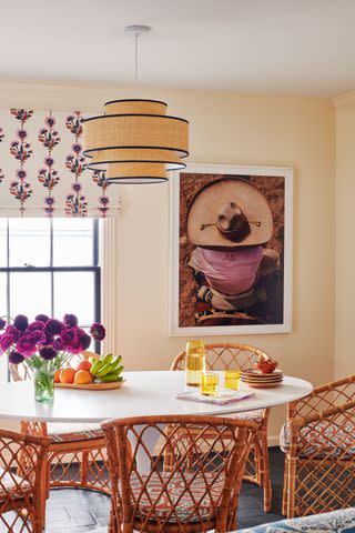
Kate Leichhardt, Courtesy of Amanda Khouri Interiors
A hint of pink adds warmth and softness to the dining room without overpowering it and still allowing other design elements to sit centerstage. More muted, mature tones give the cheerful hue a grown-up feel, separating it from the bubbly, more saturated pinks of nurseries. Incorporate rich browns to complement the lighter shade. “Getting this color just right can be tricky, but [this one] has never let me down,” says designer Amanda Khouri Interiors in Nashville, Tennessee, who used Farrow & Ball’s Setting Plaster in this traditional-meets-modern dining room.
Related: 7 Interior Paint Color Trends You’ll See Everywhere In 2025

Hector Manuel Sanchez
In lieu of a grand chandelier, the designer chose a warm, antique- style lantern from Visual Comfort & Co.
You can’t go wrong with a deep, grounding blue whether on the walls, trim, ceiling—or all the above. In her 1920s Tudor home, designer Catherine Branstetter used Farrow & Ball’s Inchyra Blue for a dramatic jewel-box like backdrop for her cozy dining room. The shade feels equally casual and elegant and is easily transitional for a home with a lighter, more neutral color palette overall. “I like having the punch of dark color in there against a lot of the house that’s lighter,” says Branstetter of the blue-grey tone.
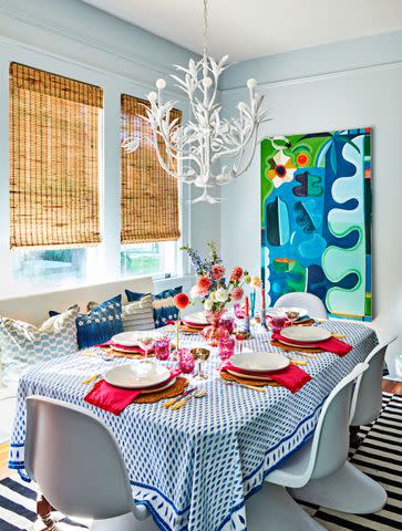
Alison Gootee; Styling: Page Mullins
For smaller dining rooms, play with finishes rather than saturation to infuse the space with character without overpowering it. Add a glossy finish to any creamy white or relaxed neutral, like Benjamin Moore’s Gerbera Daisy, and you’ve immediately elevated the room with a playful approach. This slightly peachy orange-yellow sets a refreshing tone and feels both brightening and warm—and pairs with just about any accent colors for textile layers.
JAMES RANSOM; STYLING: Veronica Olson
Soft blues can add a dose of color and energy to any room while still creating a neutral backdrop. As a nod to the South’s tradition of haint blue porch ceilings, consider taking the shade to the ceiling as well. In her personality-infused bungalow, artist Dorothy Shain Henderson carried the dining rooms’ wall color (Sherwin-Williams’ Lullaby) to the trim throughout the house as well.
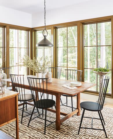
Robbie Caponetto; Styling: Kendra Surface
Looking to lean into a nature inspired palette? Try an earthy green like Sherwin-Williams’ Momentum. Just tackle the trim, as designer Lauren Liess did in the 2020 Southern Living Idea House, take it to the ceiling as an unexpected detail, or wrap the walls with the hue for a moody dining room.
link


