


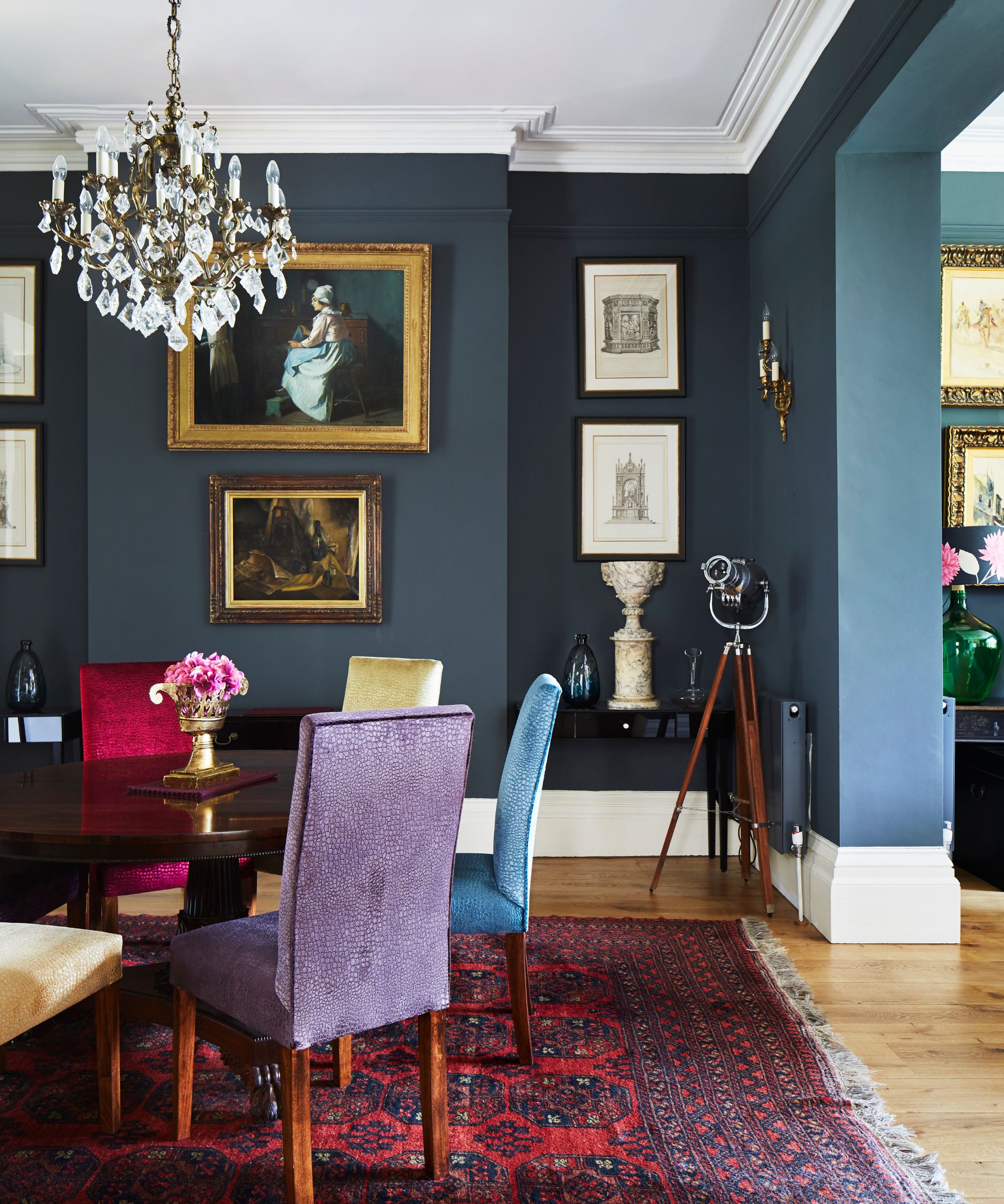
We usually associate luxury interiors with minimal palettes, whether muted or rich, but rarely have we seen a soft pastel shade paired with a vibrant primary hue as beautifully as in Drake’s glamorous dining room.
This unexpected color pairing introduced by designer Ferris Raffauli, offers a really unique twist on the luxe aesthetic, which, in this instance, is anchored by mirrored surfaces and a fabulous crystal chandelier. But the key to making this kind of color combination work is in the balance, according to the experts.
Buys Inspired by Drake’s Unexpected Dining Room Palette
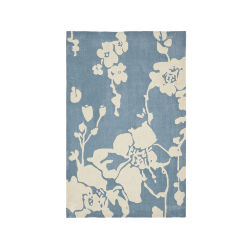

Safavieh Modern Art Area Rug
A patterned area rug in a subtle hue defines a specific zone without dominating it, especially if it picks out the dominant shade in the room like this rug and the powder blue of Drake’s dining room.
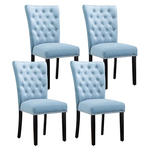

Velvet Dining Kitchen Chairs
A traditional piece, like these dining chairs, in an unexpected hue like the powder blue of Drake’s dining room, creates a welcome statement, which, when combined with a luxe fabric like velvet feels chic.

The punchy accent shade in Drake’s dining room is defined by a bouquet of beautiful red roses placed on the dining table and then picked out in various pieces visible on the reflected shelving.
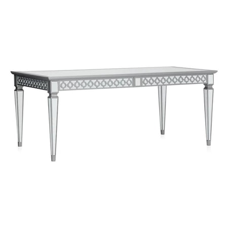

Drake’s mirror-top dining table is a clever design trick to enhance the feeling of space, and reflect both color and light around the room. This extendable version is ideal for smaller spaces that occasionally host more guests.
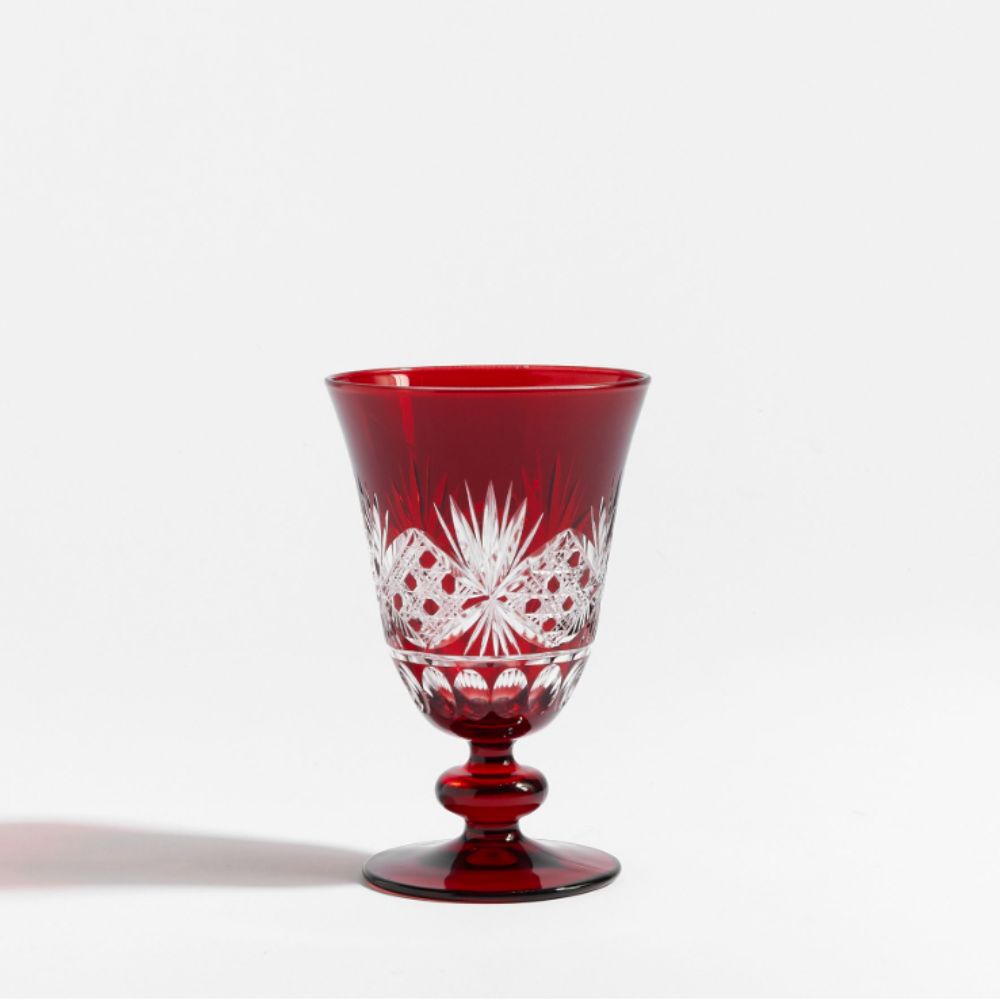
Antique Cut Glass Goblets
A few carefully chosen accent pieces in a brighter shade (red in this case), help to hang this look together and make it intentional as opposed to a random addition. This cut glass goblet would add both vibrancy and luxury to a dining room like Drake’s.
You can think about pastel room ideas as an alternative to decorating with neutrals. Robert Aumann, interior design expert, and founding partner of Luxury SoCal Realty says: ‘A soft pastel, such as blush or powder blue, can almost serve as a neutral. When you layer in a stronger color, it doesn’t feel random. The problem with combining colors is that people tend to use them in equal measure. One should be dominant, the other an accent.’
On that note, we love the way that the dining chairs and rug in Drake’s dining room come together to form the dominant shade, yet as a soft pastel, it doesn’t feel over-bearing. It’s softly reflected by the clever use of mirrors which keeps everything feeling fresh and light, with that hint of sparkle from the statement crystal-accent chandelier (similar available at Bed Bath & Beyond).
Sydney Harrell, DFW Textile Sourcing agrees: ‘I love pulling pastels into a dining room rug as a way to instantly elevate the space. Soft pinks, blues, and greens make the perfect foundation for a room that’s meant to show off china, crystal, and all those heirloom serving pieces. Going with a lighter rug is an easy way to add in some elegance while still keeping the room feeling fresh and grounded.’

(Image credit: Future)
The overall look of Drake’s dining room feels elegant and sophisticated thanks to the traditional-style furniture, and statement pieces like the dramatic crystal chandelier, with just a hint of playfulness that comes from the bold color pairing.
Robert adds: ‘In a formal dining room, symmetry and lighting are more important than color. A show-stopping chandelier and a statement focal table will anchor the space. When the architecture and the space are formal, you have more flexibility with color because the space is already composed.’
Meanwhile, the use of florals to unite the unusual color scheme feels inspired. ‘I always tell clients that using fresh flowers is the easiest way to connect unexpected colors. Nature knows how to mix colors better than we do. A sculptural flower arrangement will calm the space and keep the color palette from looking forced,’ explains Robert.
‘In high-end interior design, elegance is not about being boring with color. It’s all about how it’s grounded,’ he concludes.
There’s no need to let your taste for glamorous decor hold you back from getting creative with room color ideas. Take a leaf from Drake’s book and experiment with unusual pairings, remembering to keep one as the dominant shade and the other as an accent to ensure balance.
If you enjoy our celebrity news and interior design advice, why not sign up for our newsletter so you never miss the latest features?
link